Scaling data to normalise location and spread
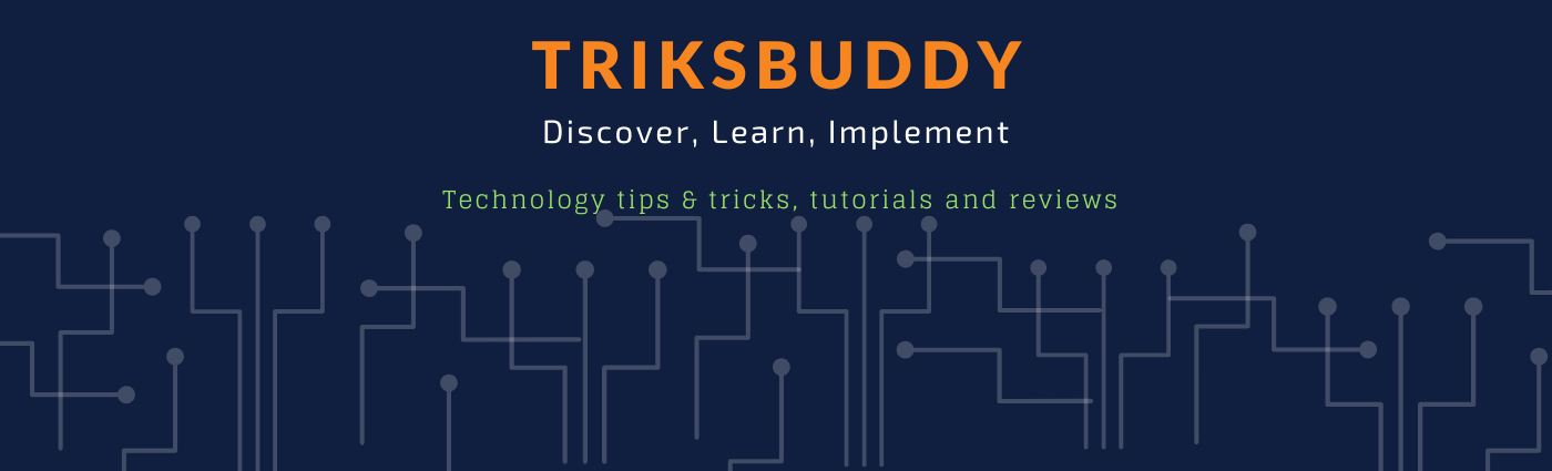
Who is the greatest sportsperson of all time? Depending on what your favourite sport is, where you're from, or how old you are, you might answer this question very differently: Serena Williams. Michael Jordan. The greatest female athlete of all time, Jackie Joyner-Kersee. Michael Phelps. We could debate this question back and forth for hours (and I encourage you to do so on the discussion forum.)
Here's my answer, based on my favourite sport, cricket, and the fact that I'm Australian: Sir Donald Bradman. As this course has an international audience, I know that some of you - does that include you? - won't recognise the name of the Australian batsman and 1936-38/1946-48 Test Cricket captain. Why is he the greatest? Because he holds the highest Test match batting average, 99.94.
Well that's a reasonably high number (quite close to 100 in fact), but if you don't know cricket, it doesn't mean much at all. You get a better idea if I tell you the next highest average is in the 60s, and better still if I tell you that most of the top 50 batting averages are all the way down in the 50s, but still: Why does this make Bradman greater than, say, Michael Jordan? Both are outliers, but which is more so?
What we really need is a way to compare different datasets; to transform them to a common scale so that we may compare observations. Fortunately, statistics provides a standard way to do this. In fact, it's so standard that we just call it standardisation. Essentially, we transform each observation
where scale(data), where data is, say, a column of values from a dataframe.
If our data is symmetric, then this is generally a good transformation to do, and if it's normally distributed, then there are some nice factoids:
- about 68% of values have
−1<z<1 , - about 95% of values have
−2<z<2 , - about 99% of values have
−3<z<3 .
So, armed with standardisation, we can now ask: Just how much of an outlier was Bradman, and how does he compare to Jordan? I did a quick search and grabbed the top 60 cricket batting averages from the ESPN cricinfo website as well as the top 250 NBA points-per-game records from the Basketball Reference website.
Here's where Jordan sits compared to the rest of the distribution:
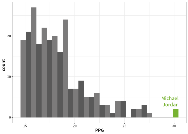
and Bradman:
And the
What about Bradman?
The greatest. Argue with us on the comment, so long as you bring data!
Log transformations to adjust for skewness
So, if our aim is to try and transform our data to a distribution which looks like a standard normal, or at least roughly symmetric, then
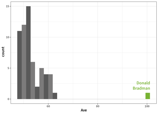
Here's an example. I do a lot of research on social media data - just today I was looking at a dataset of Twitter users, and trying to figure out how popular different users are. Here's a histogram of the follower counts of all the individuals in my dataset:
Wow, that's the most boring plot I've ever seen! Trying a bit harder shows that this is because the overwhelming majority of people don’t have many followers, but there are a few superstars in the network. In other words, the data is highly (right-) skewed.
summary(twitter)## followers
## Min. : 0
## 1st Qu.: 113
## Median : 352
## Mean : 2029
## 3rd Qu.: 1005
## Max. :1040317
ggplot(twitter, aes(followers)) + geom_histogram(breaks=seq(0,2000,10))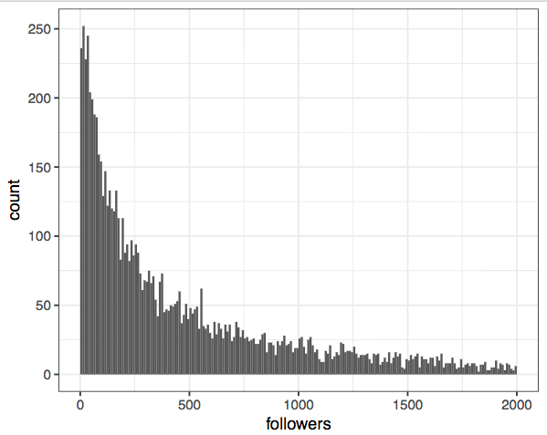
So how do we transform this to a more symmetric distribution? When confronted with skewed data a common trick is to use a log-transformation:
 twitter %>%
  mutate(logfollowers = log10(followers + 1)) %>%
  ggplot(aes(logfollowers)) +
  geom_histogram()
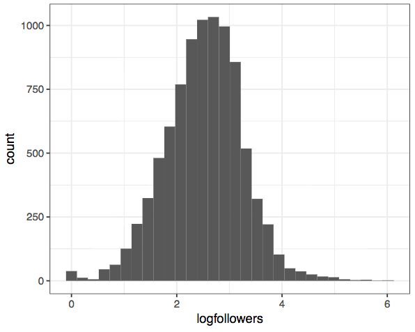
Much better! We can now see that the most common number of followers is somewhere between 100 and 1000, and that there's a surplus of users who have zero or close to zero followers (those poor people). This is the real power of transforming our data - it allows us to see these patterns much clearer. The distribution is still not perfectly normal-looking, but it's a lot closer.
If we were going to build a model from this dataset, this is the form we'd want it to be in.
Automatic transformations
This business of transforming data seems like hard work, because we need to know a little bit about our data - such as whether we expect it to be skewed or not - before we can decide on an appropriate transformation. And it becomes more complicated if we want to visualise the relationship between variables. It'd be nice if we had an automatic method we could throw at our data to find transformations automatically.
For example, I have a box of dice at home that are of various sizes. I measured the side length of each die (in cm), as well as the volume (in mL) by putting the die in a jug of water and measuring the displacement (the things I do for this course!).
Here is my data:
dice
## # A tibble: 30 × 2
##    SideWidth    Volume
##
## 1  1.0982630 1.3157179
## 2  1.2581858 1.9885099
## 3  1.5592800 3.9799294
## 4  2.0623117 8.9355229
## 5  1.0025229 1.1263681
## 6  2.0475845 8.7685033
## 7  2.1170129 9.6443364
## 8  1.6911967 4.8519828
## 9  1.6436711 4.0427611
## 10 0.7926794 0.6220378
## # ... with 20 more rows
ggplot(dice,aes(SideWidth,Volume)) +
geom_point() +
geom_smooth()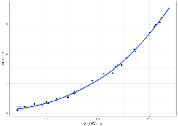
There’s clearly a non-linear relationship there (it looks like
library(caret)
bc <- BoxCoxTrans(dice$Volume,dice$SideWidth)
bc
## Box-Cox Transformation
##
## 30 data points used to estimate Lambda
##
## Input data summary:
##    Min. 1st Qu.  Median    Mean 3rd Qu.    Max.
##  0.3227  1.3585  2.7519  3.9959  6.0641 10.5502
##
## Largest/Smallest: 32.7
## Sample Skewness: 0.657
##
## Estimated Lambda: 0.3
That
dice <- mutate(dice, TransformedVolume = predict(bc,dice$Volume))
ggplot(dice,aes(SideWidth,TransformedVolume)) +
  geom_point() +
  geom_smooth()
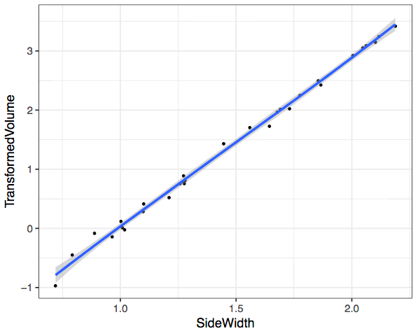
Magic! So why does this transformation work? Head over to the next video where I explain the mathematics.
The Data
Now I’m sure you think I spent ages meticulously measuring each of the dice in my collection and measuring their displacement in a jug of water. This isn’t quite the case, for starters, I don’t have enough dice!
If you want to try this yourself, then you can just run these commands:
RNGkind(sample.kind="Rounding")
set.seed(1)
l <- runif(30, 0.7, 2.2)
v <- l^3 + rnorm(30)*0.2Basic idea of PCA
In this section, you are going to learn about Principal Component Analysis (PCA). This is a common method of dimension reduction. So the questions you should be asking are: What do you mean by dimension reduction? and Why do I have to learn about PCA?
I am going to illustrate this with a motivational example. If you would like to play along, you are going to need some new data. The data is in the package mlbench so you should go and get that:
install.packages("mlbench")Now load it:
library(mlbench)This has the dataset BreastCancer
data(BreastCancer)Before we look at it, we are going to convert it to a tibble() to make it nicer to look at. Type in the command:
BreastCancer <- tbl_df(BreastCancer)Hint: If you've got an error here, make sure that you have the tidyverse library loaded.
Now you can look at it:
BreastCancer## # A tibble: 699 x 11
## Id Cl.thickness Cell.size Cell.shape Marg.adhesion Epith.c.size
## * <chr> <ord> <ord> <ord> <ord> <ord>
## 1 1000025 5 1 1 1 2
## 2 1002945 5 4 4 5 7
## 3 1015425 3 1 1 1 2
## 4 1016277 6 8 8 1 3
## 5 1017023 4 1 1 3 2
## 6 1017122 8 10 10 8 7
## 7 1018099 1 1 1 1 2
## 8 1018561 2 1 2 1 2
## 9 1033078 2 1 1 1 2
## 10 1033078 4 2 1 1 2
## # ... with 689 more rows, and 5 more variables: Bare.nuclei <fctr>,
## # Bl.cromatin <fctr>, Normal.nucleoli <fctr>, Mitoses <fctr>,
## # Class <fctr>
This dataset involves 683 biopsy samples that were submitted to Dr Wolberg, University of Wisconsin Hospitals Madison, Wisconsin, USA between 1989 and 1991. For each sample, various cellular measurements were recorded and also whether the diagnosis was malignant or benign.
(By the way: Have you ever wondered why I am such a fount of information? I would like you to think that it is because I am brilliant, and the facts come instantly from my little grey cells, but really I just know how to look things up.)
Try typing:
?BreastCancerinto the console. To the right, you should now have lots of info about the data. Nice heh?
Now we would like to know which of the nine predictors can be used to predict whether a cancer is benign or malignant. Let's have a look:
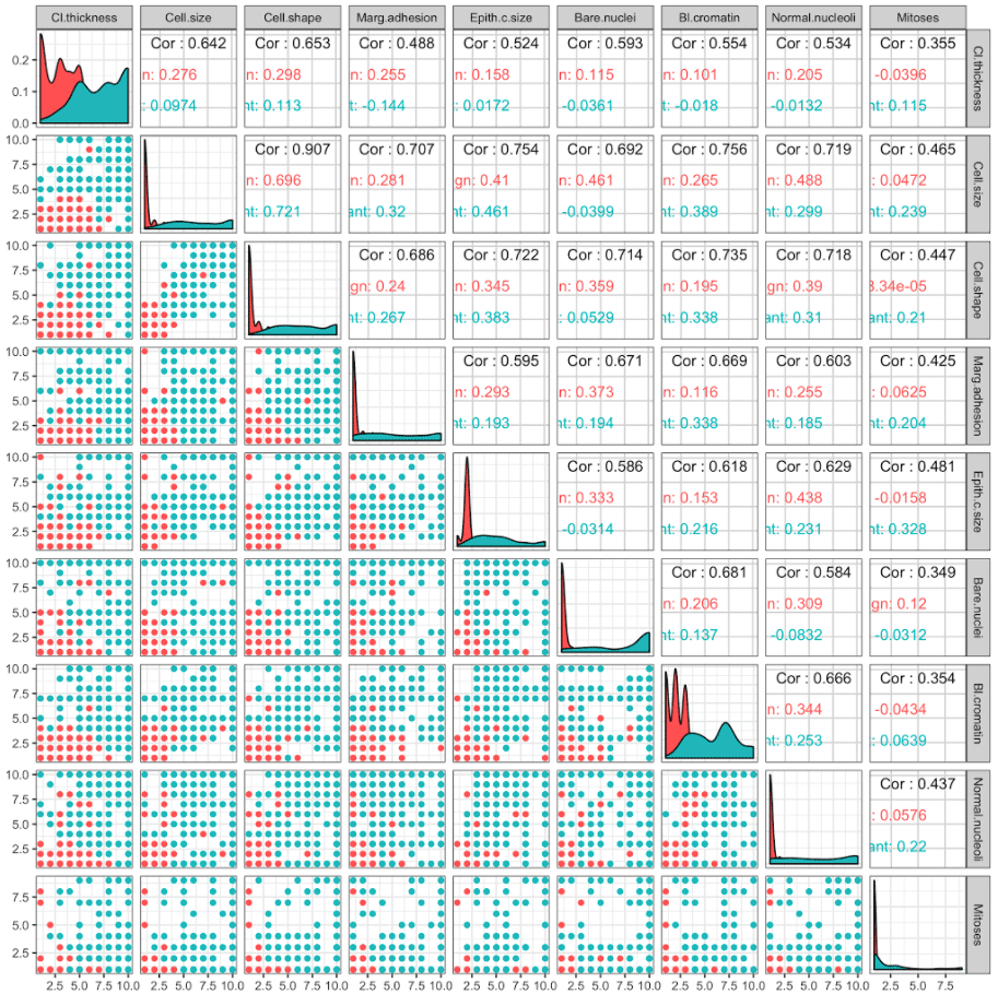
There is a lot of information to take in here, and in fact we simply have too many predictors to visualise easily.
This is where PCA comes in. PCA transforms the data into its principal components. The first principal component is the combination of the predictors that explains the most variation between subjects, based on the predictors. The second principal component is the combination of the predictors that explains the most variation between subjects based on the predictors once we have taken into account the first principal component, and so on.
I will perform the PCA on the data, and you should follow along:
- First I will remove any subjects that have missing values as PCA cannot cope with missing values:
BreastCancer <- na.omit(BreastCancer)- Next we get just the predictors:
predictors <- BreastCancer %>% select(Cl.thickness:Mitoses)
predictors
## # A tibble: 683 × 9
##    Cl.thickness Cell.size Cell.shape Marg.adhesion Epith.c.size
##
## 1             5         1          1             1            2
## 2             5         4          4             5            7
## 3             3         1          1             1            2
## 4             6         8          8             1            3
## 5             4         1          1             3            2
## 6             8        10         10             8            7
## 7             1         1          1             1            2
## 8             2         1          2             1            2
## 9             2         1          1             1            2
## 10            4         2          1             1            2
## # ... with 673 more rows, and 4 more variables: Bare.nuclei ,
## #   Bl.cromatin , Normal.nucleoli , Mitoses
- Now, PCA wants numbers not categorical variables, so we are going to convert these. I do this with the following code:
predictors <- predictors %>% mutate_all(funs(as.numeric(.)))
predictors
## # A tibble: 683 × 9
##    Cl.thickness Cell.size Cell.shape Marg.adhesion Epith.c.size
##
## 1             5         1          1             1            2
## 2             5         4          4             5            7
## 3             3         1          1             1            2
## 4             6         8          8             1            3
## 5             4         1          1             3            2
## 6             8        10         10             8            7
## 7             1         1          1             1            2
## 8             2         1          2             1            2
## 9             2         1          1             1            2
## 10            4         2          1             1            2
## # ... with 673 more rows, and 4 more variables: Bare.nuclei ,
## #   Bl.cromatin , Normal.nucleoli , Mitoses
This is a bit above your pay grade as yet. .
- Now we will perform PCA and get the first two principal components:
PCA <- princomp(predictors, scores = TRUE)
BreastCancer$PC1 <- PCA$scores[,1]
BreastCancer$PC2 <- PCA$scores[,2]
- Finally, we look at the points:
ggplot(BreastCancer,aes(PC1, PC2)) +
geom_point(aes(col = Class))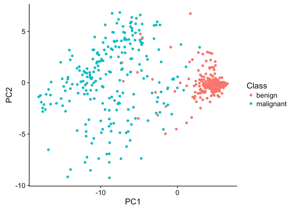
Now you can see something of interest: The first principal component separates the subjects reasonably well into benign and malignant. That is a good start.
Now that you are motivated, take a look at the mathematics.
Term Frequency - Inverse Document Frequency (TF-IDF): Mathematics and R code
Coming back to our case studies of text analysis, you've already seen how to summarise raw text data using word counts, and use this to compare texts. Now we'll look at some common transformations on these types of datasets. One issue with text data that we came across in Section 2 is that datasets like novels contain a lot of common "stop words" which don't carry much information, eg. "the", "and", "of", etc. We'd like to transform text data to emphasise the words which carry meaning, and even better, the words which help us distinguish between documents.
One common transformation to do this is called term frequency - inverse document frequency (TF-IDF), and it works like this. For a given word or term
and then the TF-IDF transformation for
You're going to look at the words which distinguish between different eras in the history of physics. First, you'll need to download books by some physicists from Project Gutenberg:
library(gutenbergr)
library(tidytext)
physics <- gutenberg_download(c(37729, 14725, 13476, 5001),
                              meta_fields = "author")
physics_words <- physics %>%
  unnest_tokens(word, text) %>%
  count(author, word, sort = TRUE) %>%
  ungroup()

physics_words
## # A tibble: 12,592 × 3
## author word n
##
## 1 Galilei, Galileo the 3760
## 2 Tesla, Nikola the 3604
## 3 Huygens, Christiaan the 3553
## 4 Einstein, Albert the 2994
## 5 Galilei, Galileo of 2049
## 6 Einstein, Albert of 2030
## 7 Tesla, Nikola of 1737
## 8 Huygens, Christiaan of 1708
## 9 Huygens, Christiaan to 1207
## 10 Tesla, Nikola a 1176
## # ... with 12,582 more rows
These famous scientists write "the" and "of" a lot. This is not very informative. Let's transform the data using TF-IDF and visualise the new top words using this weighting. We remove a curated list of stop words like "fig" for "figure", and "eq" for "equation", which appear in some of the books first:
physics_words <- physics_words %>%
  bind_tf_idf(word, author, n)

mystopwords <- data_frame(word = c("eq", "co", "rc", "ac", "ak", "bn",
                                   "fig", "file", "cg", "cb", "cm"))

physics_words <- anti_join(physics_words, mystopwords, by = "word")

plot_physics <- physics_words %>%
  arrange(desc(tf_idf)) %>%
  mutate(word = factor(word, levels = rev(unique(word)))) %>%
  group_by(author) %>%
  top_n(15, tf_idf) %>%
  ungroup %>%
  mutate(author = factor(author, levels = c("Galilei, Galileo",
                                            "Huygens, Christiaan",
                                            "Tesla, Nikola",
                                            "Einstein, Albert")))

ggplot(plot_physics, aes(word, tf_idf, fill = author)) +
  geom_col(show.legend = FALSE) +
  labs(x = NULL, y = "tf-idf") +
  facet_wrap(~author, ncol = 2, scales = "free") +
  coord_flip()
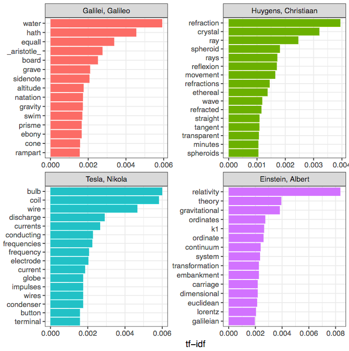
Look at that! This has revealed that:
- Galileo wrote more about "water" and "gravity"
- Huygens was most concerned with "refraction"
- Tesla was most concerned with electricity ("bulb", "coil", "wire"), and
- Einstein, of course, was concerned with "relativity".
That's a nice little potted history of a few hundred years of progress in physics for you! And all revealed algorithmically from the writings of the people themselves.