
How to produce a scatter plot
In this section, we'll look at one of the most basic tools for visualising relationships between continuous variables - the scatter plot. We'll be using ggplot again here.
Scatter plots are great. They allow you to visually represent your data, and if relationships exist between the variables plotted, you'll be able to see them straight away.
Let's dive straight in with an example, using the good old mpg dataset.
We'd like to know if there's a relationship between a car's engine size (the displ variable) and its fuel efficiency in the city (the cty variable, measured in miles per gallon). It feels like there should be a relationship there, right? (What direction do you expect the relationship to be?) To find out, type:
ggplot(mpg) +
geom_point(mapping = aes(x  = displ, y = cty))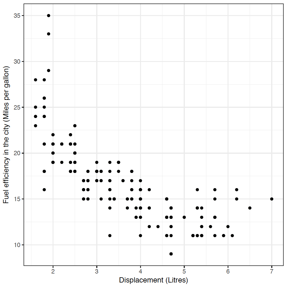
Yes! As engine size increases, fuel efficiency decreases. If you didn't get a plot, you may need to type library("tidyverse") again.
This code worked in much the same way as our barchart and histogram from Section 1 - we defined a canvas and the mpg dataset using ggplot(mpg), and then added a layer of points geom_point, with an aesthetic mapping displ to the x-axis, and cty to the y-axis.
Visualizing Relationships using ggplot
Adding aesthetics
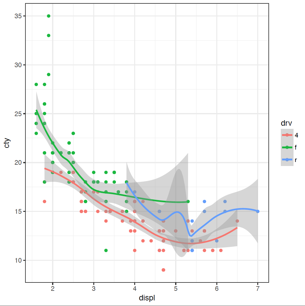
It's great to see the inverse relationship between engine size and fuel efficiency, but I feel like there are other dimensions here. For instance, a few cars stick out from the pack towards the lower right of this dataset. What's going on with them?
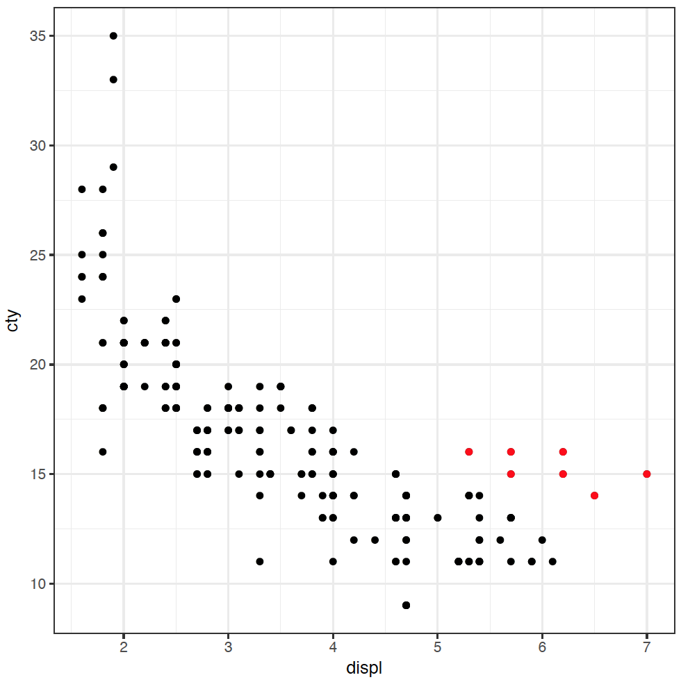
These cars have large engines, but are slightly more fuel efficient. I have a hypothesis that these cars are rear-wheel drive. It feels like they probably have larger engines than front-wheel drive, and maybe they're more efficient as well (you might be able to tell that I don't know a lot about cars). To investigate this hypothesis, we can colour the points in the plot by the type of "drive" of the car, variable drv:
ggplot(mpg) + geom_point(mapping = aes(x = displ, y = cty, colour = drv))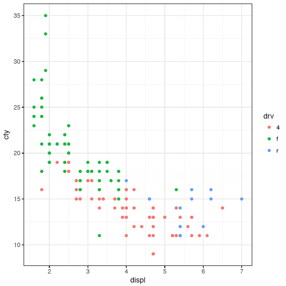
(If you are American, you're welcome to spell "colour" the wrong way - without the "u" - as the plot will still work.) The points are coloured now by the type of drive: front f, rear r, or 4-wheel 4. We can now see clearly that four-wheel drive cars are generally less fuel efficient, and front-wheel drive cars have usually got smaller engines.
It looks like the answer about whether those outlying cars are rear-wheel drives or not is a resounding "maybe". Some of the cars in that group are rear-wheel drive, but not all. We would need to do some more investigation here, but we have learnt some new things about our dataset through this explanation.
Adding layers
As we've alluded to already, ggplot is built upon layers, making it an incredibly powerful tool for creating more complex visualisations. The layers let us build up the plot adding extra visualisations to discover the patterns in the data. For example, adding a trendline to our original scatter plot is simple:
 ggplot(mpg) +
  geom_point(mapping = aes(x  = displ, y = cty)) +
  geom_smooth(mapping = aes(x  = displ, y = cty))
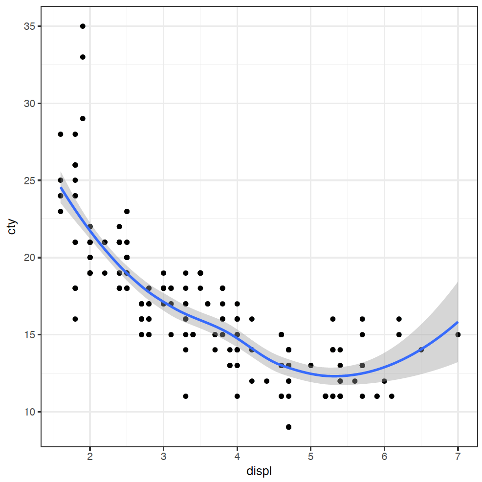
I have added the trendline as it makes it easier to visualise the relationship.
It's a bit painful to have to type that mapping out twice, so we can make our code a little bit more compact:
 ggplot(mpg, mapping = aes(x  = displ, y = cty)) +
  geom_point() +
  geom_smooth()
Adding separate trendlines for each type of drive in our coloured scatterplot is similar:
 ggplot(mpg, mapping = aes(x = displ, y = cty, colour = drv)) +
  geom_point() +
  geom_smooth()
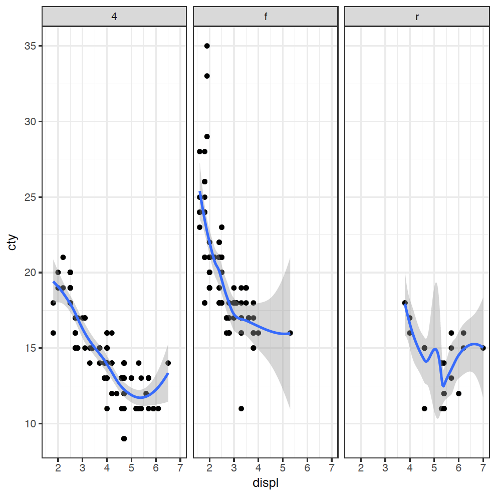
Our figure is now getting a bit messy, so we can split each type of drive into its own plot using a facet_wrap:
 ggplot(mpg, mapping = aes(x = displ, y = cty)) +
  geom_point() +
  geom_smooth() +
  facet_wrap( ~ drv)
Describing relationships between different types of variables
Which plot do I want?
You should now recognise that there are two main types of variables: quantitative and categorical. When illustrating the relationship between variables, the plot we use is dictated by the type of variable we are comparing.
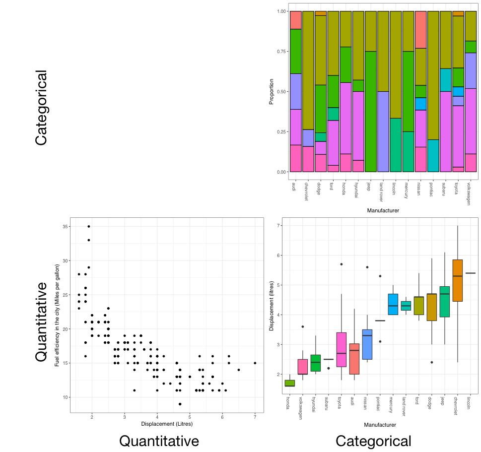
From the figure we can see that the plots are:
- Categorical (C) versus categorical (C): barcharts
- Quantitative (Q) versus quantitative (Q): scatterplots, and
- Quantitative (Q) versus categorical (C): boxplots.
For the final segment - categorical (C) versus quantitative (Q) - we can also use boxplots. While these suggestions are not the only possibilities, they are a good starting point.
Interpreting plots
Q vs Q: Strength, linearity, outliers, direction
First, direction.
This describes how the variable on the vertical y-axis changes as the variable on the horizontal x-axis increases. This scatterplot has a positive direction, as when we go from left to right, the points generally increase. The next scatterplot has a negative direction, because the points decrease when we go from left to right.
This is described as weak... moderate... or strong.
cor(mpg$displ,mpg$cty)
It should only be used with a scatterplot. For example, take a look at this scatterplot. It has a definite relationship, which is very strong, but it has a correlation of 0. Correlation is all about linear relationships. You need to look at the data to see non-linear relationships like this one.
against the displacement. Think about if it passes the stupidity test. That is, does it make sense in context? Probably cars with bigger displacement are more powerful, but most likely to be less fuel efficient, so this relationship does make sense.
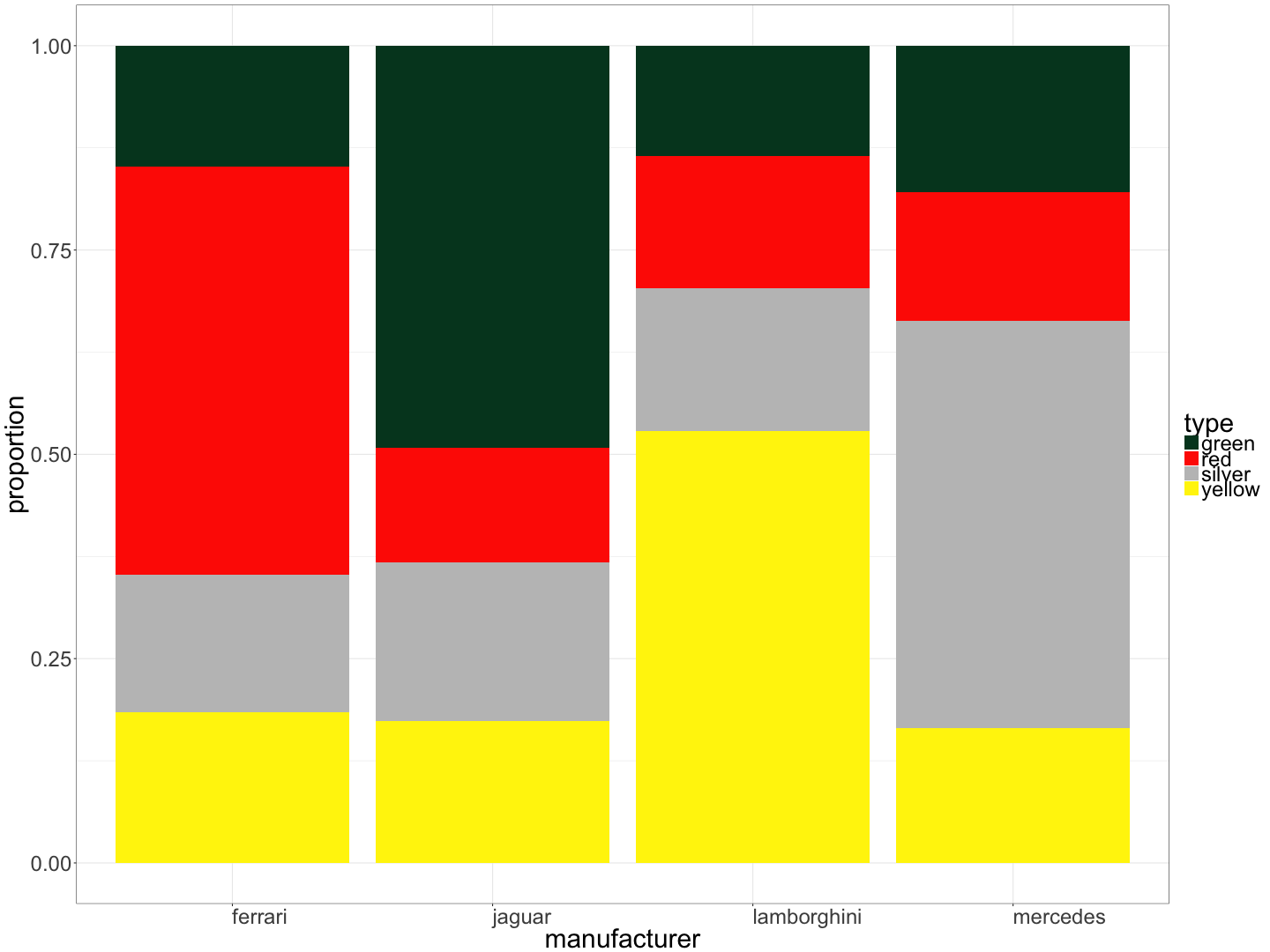
Bar chart showing the proportion of cars of each colour, by manufacturer:
A luxury car dealership sells cars from four manufacturers (Ferrari, Jaguar, Lamborghini, and Mercedes) in four colours (green, red, silver, and yellow). Below is a bar chart showing the proportion of cars of each colour, by manufacturer.
Bar chart showing the average winning margin by venue:
The Australian Football League (AFL) plays games at 9 “home” venues. The results for all VFL/AFL games played at these home venues from 8 May 1897 to 23 July 2017 (inclusive) were analysed, and the average winning margin at each venue calculated. Below is a bar chart showing the average winning margin by venue.

Scatterplot of Petal.Width vs Petal.Length:
The lengths and widths of petals and sepals were recorded for 150 Irises from three species. Below is a scatterplot of Petal.Width vs Petal.Length.
library(tidyverse)
head(iris)
## Sepal.Length Sepal.Width Petal.Length Petal.Width Species
## 1 5.1 3.5 1.4 0.2 setosa
## 2 4.9 3.0 1.4 0.2 setosa
## 3 4.7 3.2 1.3 0.2 setosa
## 4 4.6 3.1 1.5 0.2 setosa
## 5 5.0 3.6 1.4 0.2 setosa
## 6 5.4 3.9 1.7 0.4 setosa
ggplot(iris) +
  geom_point(mapping = aes(x = Petal.Length, y = Petal.Width, colour = Species))
Getting the dataframe right
For the final part of this section, you're going to have a turn at using what you've learnt so far to analyse some very messy datasets - books - and visualise the relationships between them.
But first, we need to prepare our data.
We've seen in Section 1 how to import the complete novels of Jane Austen into R, and tidy them so that each word is a subject:
library(tidyverse)
library(tidytext)
library(janeaustenr)
library(stringr)
original_books <- austen_books() %>%
  group_by(book) %>%
  mutate(linenumber = row_number(),
         chapter = cumsum(str_detect(text, regex("^chapter [\\divxlc]",
                                                 ignore_case = TRUE)))) %>%
  ungroup()
tidy_books <- original_books %>%
  unnest_tokens(word, text)
Now, if we want to count the number of instances of each word, we can use the count function in the dplyr package, which we'll be using extensively in the next section.
library(dplyr)
tidy_books %>%
  anti_join(stop_words) %>%
  count(word, sort = TRUE)
## # A tibble: 13,914 x 2
##      word     n
##     <chr> <int>
##  1   miss  1855
##  2   time  1337
##  3  fanny   862
##  4   dear   822
##  5   lady   817
##  6    sir   806
##  7    day   797
##  8   emma   787
##  9 sister   727
## 10  house   699
## # ... with 13,904 more rows
We've removed common "stop words" here before counting, and used the "pipe" function %>% to pass the output of each line directly to the next. We can use this to make a plot by piping directly to ggplot:
tidy_books %>%
  anti_join(stop_words) %>%
  count(word, sort = TRUE) %>%
  filter(n > 700) %>%
  ggplot(aes(word, n)) +
  geom_col()
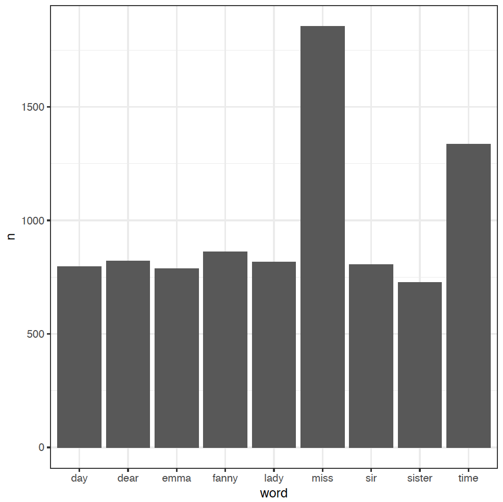
We've added an extra step here to filter out the less-frequent words, and used a new column plot geom_col in ggplot to just plot the word counts n as bars.
We'll make use of the gutenbergr package here too, which lets us download novels from the Project Gutenberg website directly into R. For example, to download Dickens' novel Oliver Twist, we would go to Project Gutenberg, search for the novel, then look at the unique ID for the novel in the URL at the top of the page. For Oliver Twist, this ID is 730. Install the gutenbergr package (see Section 1 for a reminder) and then:
library(gutenbergr)## Warning: package 'gutenbergr' was built under R version 3.4.1oliver_twist <- gutenberg_download(730)
oliver_twist## # A tibble: 18,798 x 2
## gutenberg_id text
## <int> <chr>
## 1 730 OLIVER TWIST
## 2 730
## 3 730 OR
## 4 730
## 5 730 THE PARISH BOY'S PROGRESS
## 6 730
## 7 730
## 8 730 BY
## 9 730
## 10 730 CHARLES DICKENS
## # ... with 18,788 more rows
And you can collect multiple books by providing a list. For example, to get both of Lewis Carroll's "Alice" novels, Alice's Adventures in Wonderland (ID 11) and Through the Looking-Glass (ID 12):
alice_books <- gutenberg_download(c(11,12))We're now ready to have a lot of fun, visualising the most frequent words for different authors, as well as the relationships between different texts.