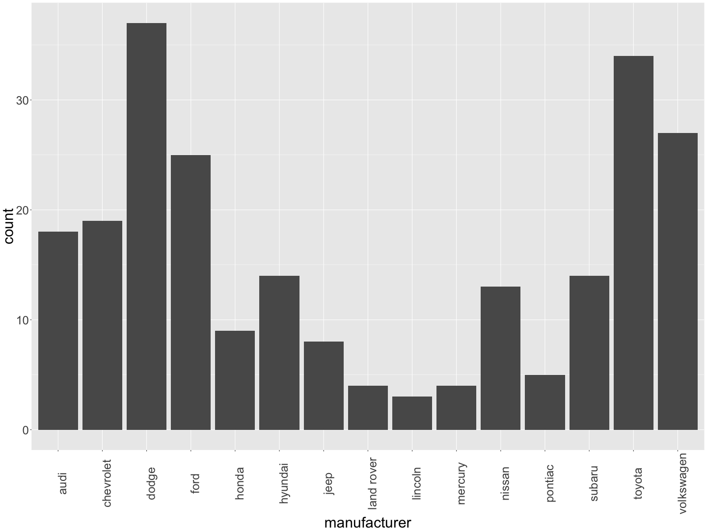
Now that you know a bit about subjects and variables, it's time for a deeper dive on summarizing different types of variables. Let's start with categorical variables: the appropriate way to summaries categorical variables is using tables and barcharts.
Looking again at the mpg dataset, a good guide is that the columns containing characters <chr> are categorical variables. Take a look at the first column, the manufacturer. How many of each brand of car are there?
One way to answer this is to make a table. Do you remember how to select columns? Making a table of counts of each type is not much more difficult:
table(mpg$manufacturer)
##
##       audi  chevrolet      dodge       ford      honda    hyundai
##         18         19         37         25          9         14
##       jeep land rover    lincoln    mercury     nissan    pontiac
##          8          4          3          4         13          5
##     subaru     toyota volkswagen
##         14         34         27
This shows you that there are 18 Audis in the dataset, 19 Chevrolets, and so on. Fine, but you might like to know the proportion of each type of car, and dividing by 234 isn't such a simple thing to do in your head (at least, not for everyone!). Luckily, you can pass the table to the R function prop.table to convert all these numbers into proportions:
prop.table(table(mpg$manufacturer))
##
##       audi  chevrolet      dodge       ford      honda    hyundai
## 0.07692308 0.08119658 0.15811966 0.10683761 0.03846154 0.05982906
##       jeep land rover    lincoln    mercury     nissan    pontiac
## 0.03418803 0.01709402 0.01282051 0.01709402 0.05555556 0.02136752
##     subaru     toyota volkswagen
## 0.05982906 0.14529915 0.11538462
So, now you know that about 15.8% of the cars are Dodges, and 10.7% are Fords. It might be nicer still to represent this information as a bar chart, so you don't have to read all those numbers. This is where you turn to your newest friend, the ggplot package, which will become our constant companion over the next few sections. To create a barchart, type the command
ggplot(mpg,aes(manufacturer)) +
geom_bar() +
theme(text = element_text(size = 30), axis.text.x = element_text(angle = 90))


No comments:
Post a Comment
Please keep your comments relevant.
Comments with external links and adult words will be filtered.